Cobscook Institute, founded in 1999, is a nonprofit organization in Trescott, Maine with a mission to create responsive educational opportunities that strengthen personal, community, and global well-being.
This project included a complete rebranding of Cobscook Institute, formerly Cobscook Community Learning Center. Deliverables included new organization and division logos, materials, and a style guide.
“Cobscook” is derived from the Passamaquoddy word “kapsq,” meaning waterfall, falls, rocky river bed with rocks exposed so that the water is “boiling,” and “kapskuk,” the name for the Cobscook Bay region.¹
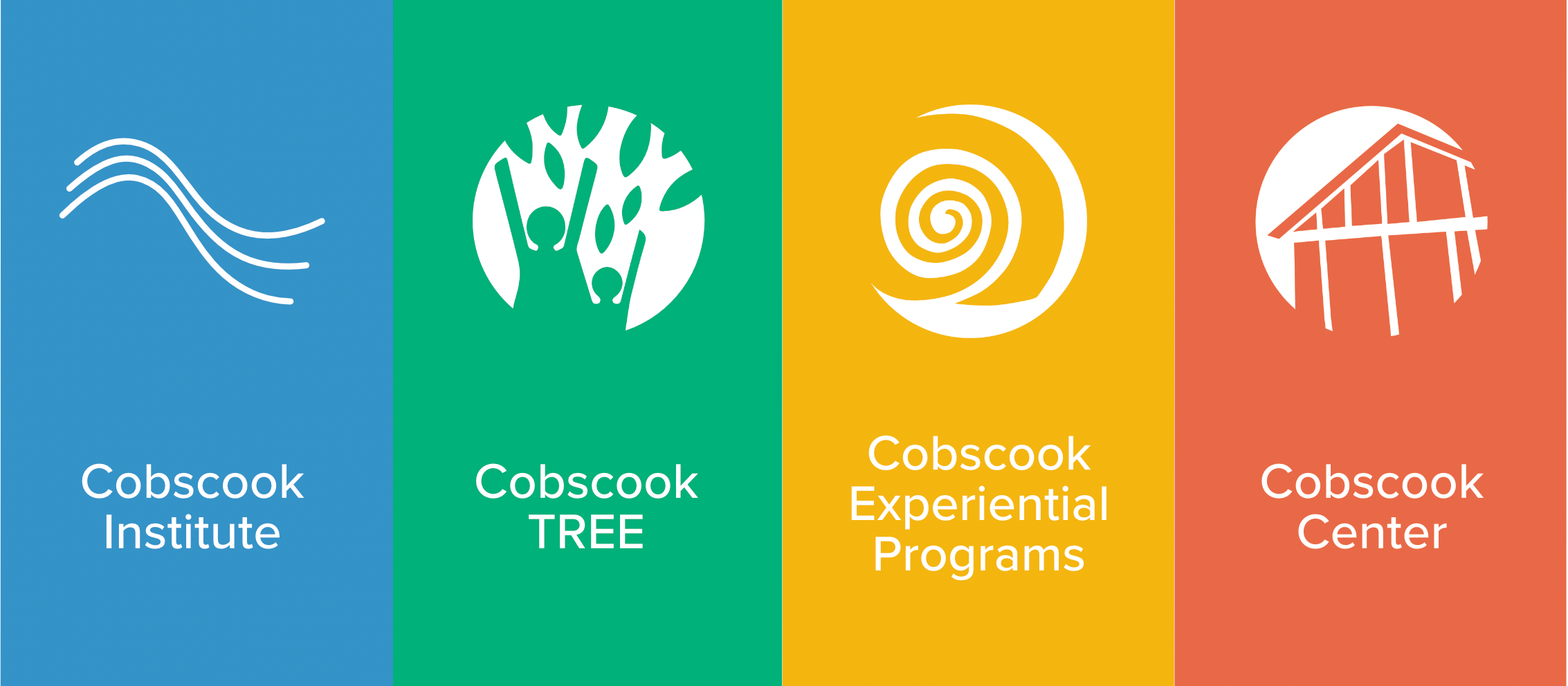
The Cobscook Institute logo was designed to incorporate the waves splashing onto shore from the original CCLC logo, symbolizing the boiling waters that the Cobscook Bay region and organization are named for.
The three waves represent the three nations that the organization serves: Passamaquoddy, American and Canadian. They also represent the three divisions of the organization. Logomarks were designed for each division of the organization, incorporating existing logos and symbolism.
The blue main brand color was chosen to symbolize the water in the logo, and colors for each division were chosen in an analogous palette, and assigned to best match previous branding and colors.
(Click thumbnails to view)
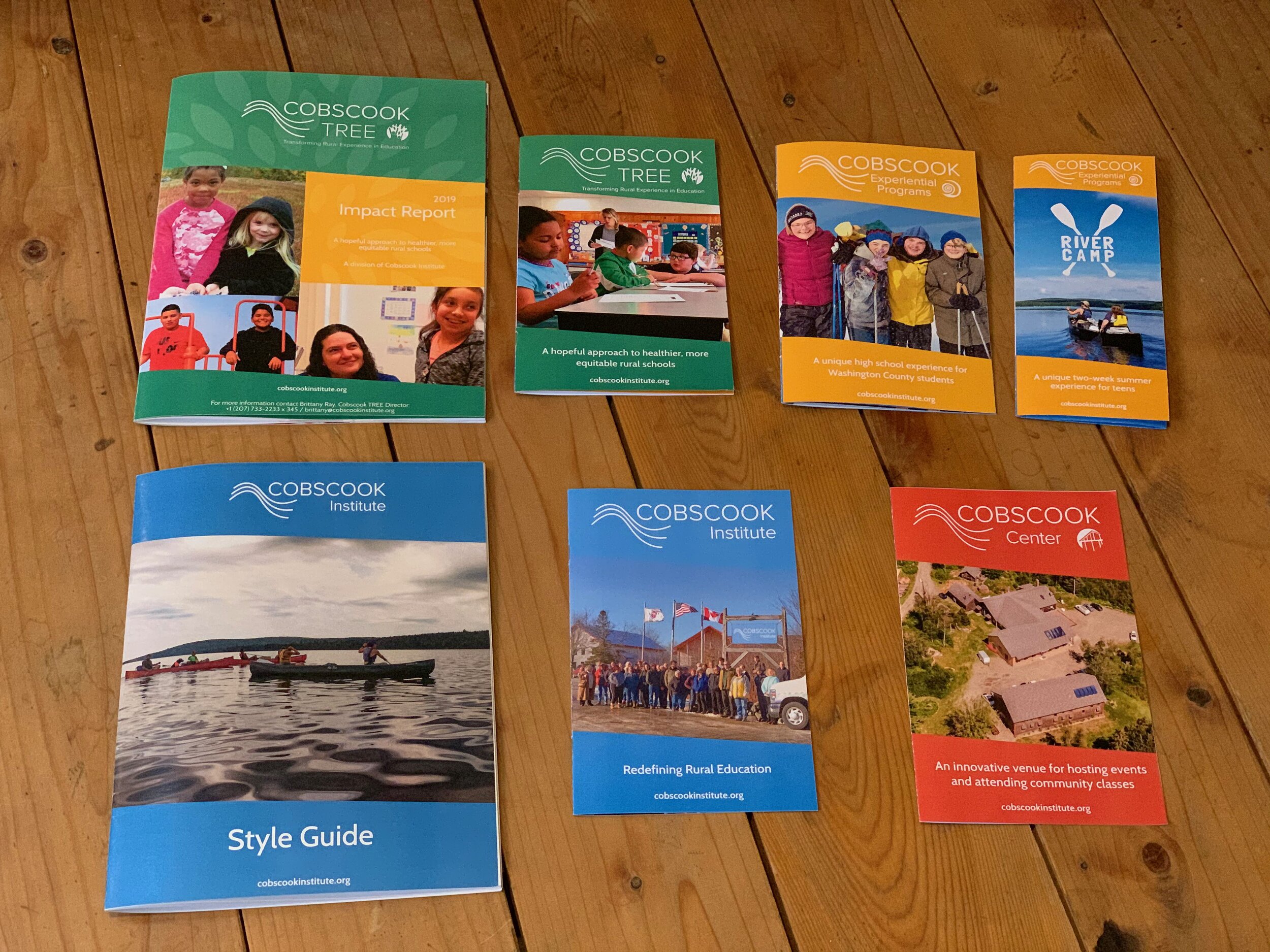
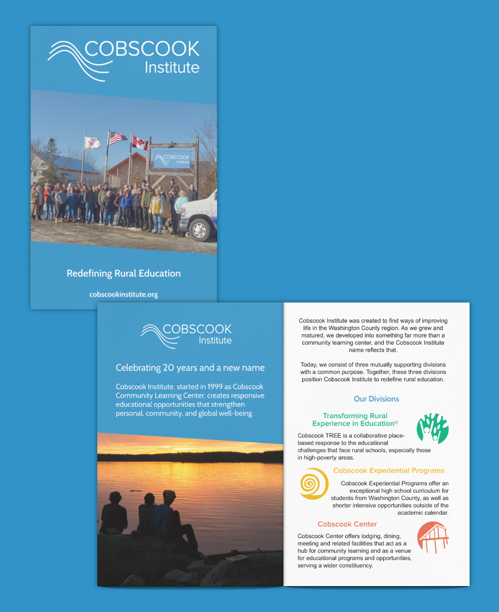
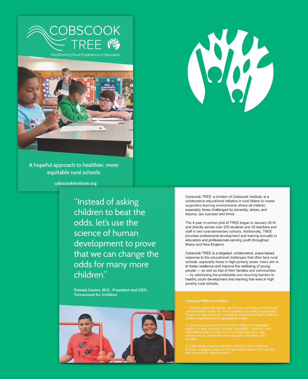
Brochures for the organization and each division were designed to showcase and market the programs to community members and potential donors.

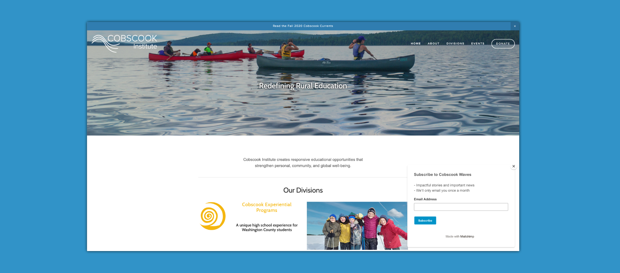
The organization’s website was rebuilt from the ground up using the Squarespace platform for its simplicity, customizability, and ease of use for staff.
Custom code solutions were developed to ensure that the website functioned exactly as the organization needed, and for seamless integration with existing systems for community events, digital signage on campus, newsletters, and more. View Website
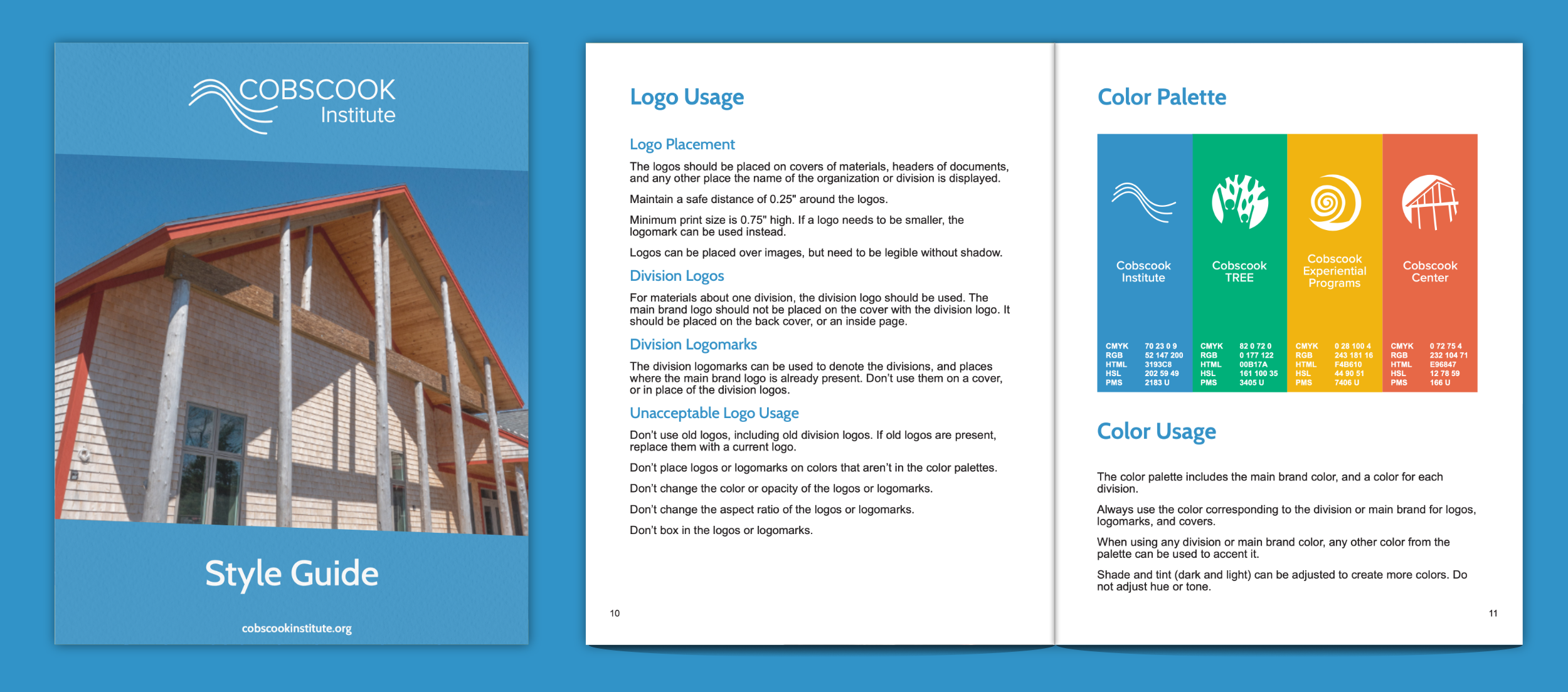
A Style Guide was created to ensure that current and future staff will be able to use the new branding in an effective way when creating materials and marketing campaigns, and for communications. View Style Guide
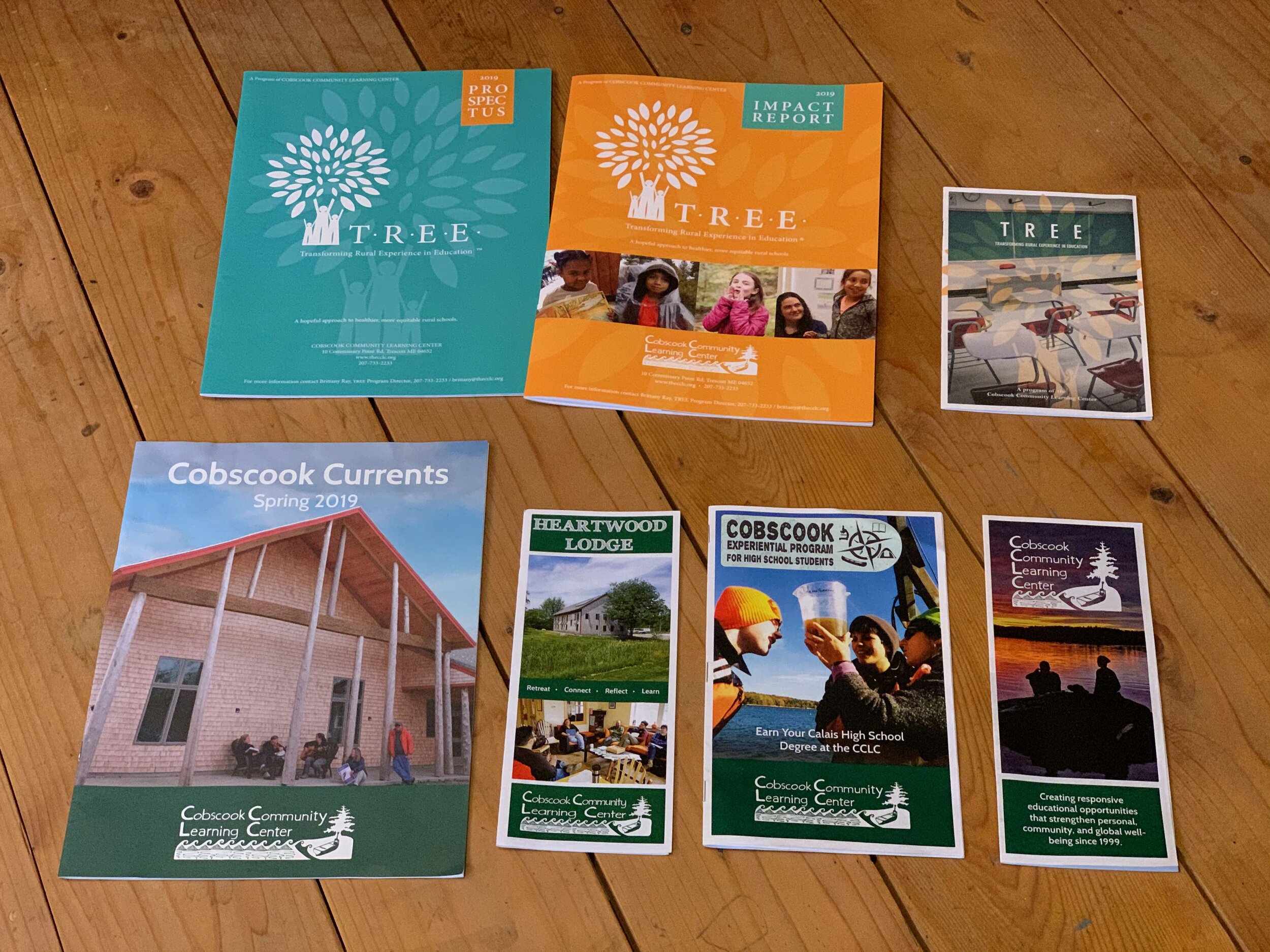
Old materials and collateral (left) used varying designs, and the layout, colors and fonts clashed with each other, preventing a cohesive visual identity.
New materials and collateral (right) were all designed with a consistent brand in mind, providing cohesive visual messaging for all of the programs.
